Viewing Monitoring Data in Proberix
Monitoring data provides valuable insights into the performance and availability of your website or API endpoints, helping you identify issues and trends that could impact your service.
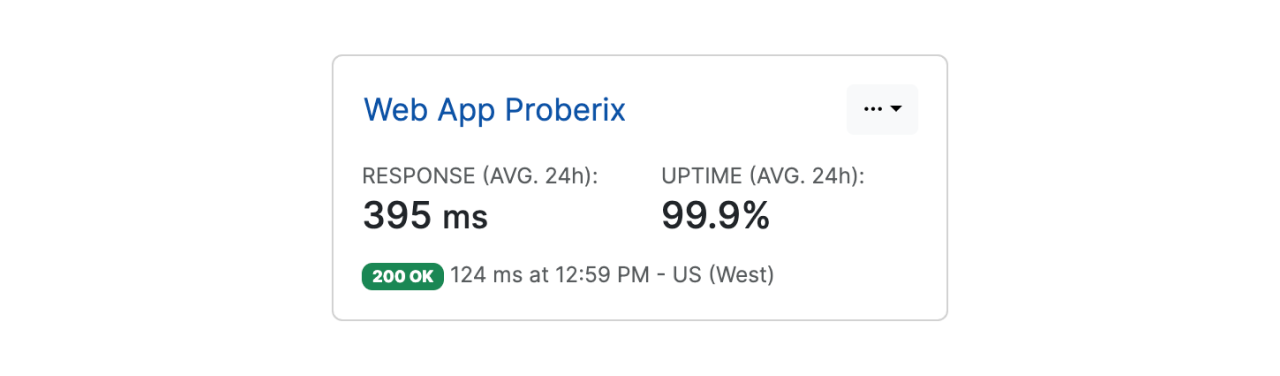
The Probes section provides a snapshot list of all existing probes for the account.
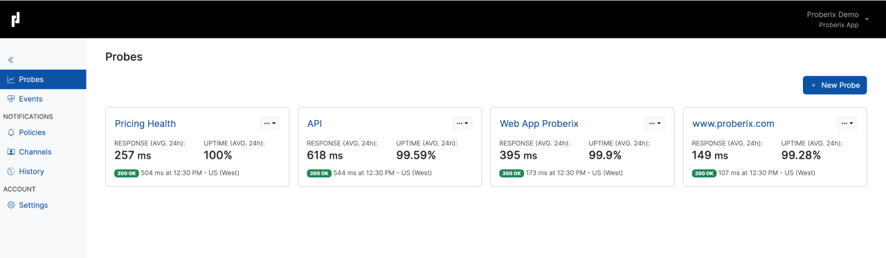
Each probe in this list displays the average response time and uptime percentage for the last 24 hours, offering a quick overview of how each endpoint has been performing. Additionally, the list includes information about the most recent check performed by each probe. This information comprises the HTTP status code, the exact time the probe was executed, and the location from which the probe was performed.
For example, you might see an entry like
"200 OK, 392 ms at 12:23 PM - US (West)."
The Probes section is automatically refreshed, allowing users to keep this page open for a real-time overview of all active probes and their current statuses. This feature ensures that you are always up-to-date with the latest performance data for your monitored endpoints.
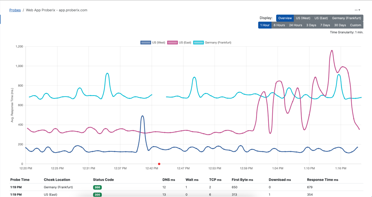
If you drill down or click on a probe snapshot in the Probes section, it will open a detailed view that includes reporting charts and results for that specific probe. Within this detailed view, there is a Display switch that allows you to toggle between two different views:
Overview
This view combines all response time line charts for all monitoring locations into a single graph. This is useful for getting a holistic view of how the endpoint is performing across different regions.
Specific Location
When this option is selected, the graph will display a stacked area chart representing the response time from the selected location. This chart includes a breakdown of all the key socket measurements that compose the total response time, such as DNS resolution time (DNS ms), connection time (TCP ms), waiting time (Wait ms), time to first byte (First Byte ms), and download time (Download ms). These metrics provide a detailed insight into where any delays might be occurring within the overall response time (Response Time ms).
The reporting interval can be customized to suit your analysis needs. You can select either a relative time frame or an absolute time range:
Relative Time Frames
These options include predefined intervals such as Last 1 hour, 6 hours, 24 hours, 3 days, 7 days, and 30 days. Selecting one of these intervals will automatically adjust the displayed data to cover the specified period leading up to the current time.
Absolute Time Range
By selecting the Custom option, you can open a calendar interface that allows you to specify an exact start and end time for your data analysis. This is useful when you need to focus on a particular event or time period in detail.
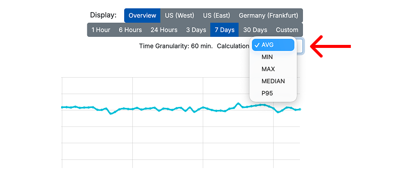
For shorter periods, data is displayed with fine granularity (1-minute intervals), allowing you to see detailed fluctuations and trends. For longer periods, the data is aggregated to provide a clearer overview, with the granularity adjusted accordingly to maintain a meaningful and readable chart.
When viewing aggregated data, you can choose how the response time is calculated for each time bucket. Available calculation methods include Average, Minimum, Maximum, P95, and Median. Use Average for a general trend, P95 to understand slower responses that may affect users, and Maximum to spot short response time spikes.
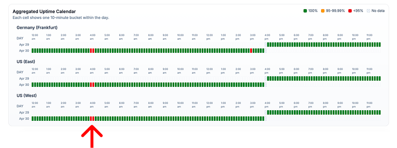
Aggregated views also include an uptime calendar. Each cell represents one aggregated time bucket for a monitoring location. Green buckets indicate full uptime, while yellow or red buckets show degraded uptime during that period.
Yellow and red buckets are interactive. Click one to drill down into that exact period and review the underlying probe results. This helps you move from a high-level report to the specific checks that caused the degradation.
Relative reporting ranges are auto-refreshing, meaning that new data will automatically show up as it comes in.
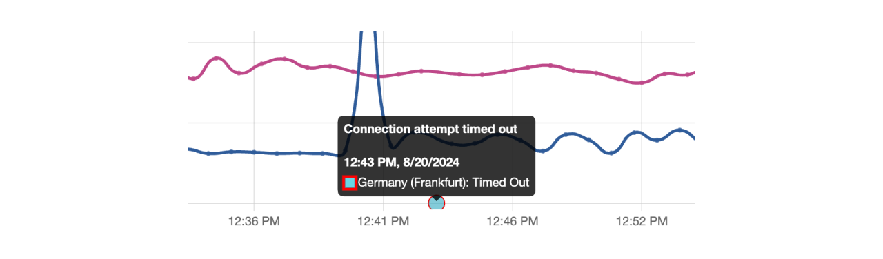
Errors for failed checks are clearly marked on the chart with red circles, each indicating a point where a failure occurred. These markers will display the error code or the specific reason for the failure when hovered over.
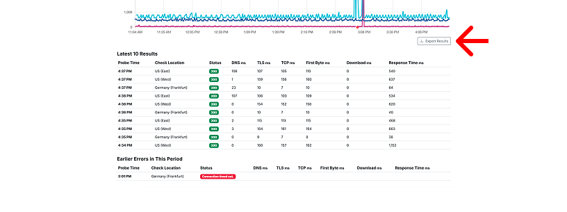
Under the chart, Proberix shows the latest checks so you can quickly review the most recent probe activity. If there were earlier errors in the selected period, they are surfaced separately below the latest checks, making it easier to notice failures that are no longer visible in the most recent results. To work with the full selected period outside Proberix, use the Export Results action to download the data as a CSV file.
This view focuses on providing detailed reporting for the selected probe, offering in-depth insights into its performance and any issues encountered. If you need an overview of all events happening across all probes within your account, you can check the Events section. The Events section provides a comprehensive look at all significant incidents and alerts across your entire monitoring setup, giving you a broader perspective on the overall health of your endpoints.